To further improve the user experience, there will be some changes to the doo navigation:
1. New event detail page
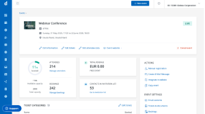 All event settings and the individual steps of the event creation process can now be accessed directly from the new event details page. If you want to make changes to the event information, ticket categories or attendee questions, you can go to the corresponding pages with one click – you no longer need to click through the individual steps of event creation.
The event settings overview page was removed – all settings can now be found in the right sidebar of the event details page.
2. Main menu collapsable
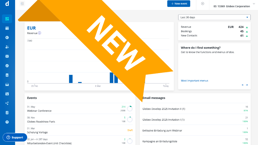
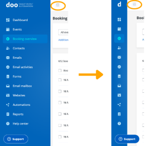 The left main menu can now be collapsed. The individual menu items are then only displayed as icons on the left side. Collapsing the menu allows you to create more space, e.g. for managing attendee and booking overviews.
Of course, you can also expand the menu again at any time to see the familiar navigation with the labels of the individual menu items.
3. Button to create a new event
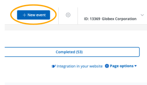
The button to create a new event can no longer be found in the left main menu, but in the top right header. Nothing has been changed in the creation process: You still need to go through the three steps to create a new event.
We hope that you will quickly get used to the new navigation and that the innovations will make it even easier for you to use our platform.

