Mobile optimization: Customize your site for all your devices
1. Why do I need mobile optimization?
How many of your customers surf on mobile devices (cell phones, tablets)? You should get to the bottom of this question. A mobile-optimized website not only convinces your visitors, but is also beneficial for your Google ranking, for example.
For you, this means that you should address responsiveness primarily for two reasons: Usability and search engine optimization.
2. Where can I see how my website currently looks on different devices? What do I have to pay attention to in general?
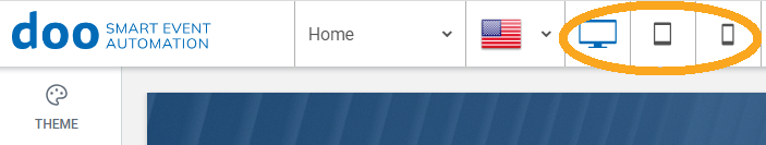
2.1 Switch views
To see how your website currently looks on the different devices, you can easily switch to the appropriate view. To do so, simply click on the corresponding icon for PC, tablet and mobile view in the top left corner of the title bar.
The preview views are not always 100% accurate, since the font size in the browser, the selected font in the browser or general features of the browser can lead to deviating results.
For security reasons, you should therefore ideally always access the website from a real device after making major changes.
2.2 What do I have to pay attention to in general?
The doo website editor performs most of the adjustments for an optimal display on mobile devices itself. For example, whenever someone enters a website, it automatically queries the respective device (specifically the size and available resolution of the device) and automatically adapts the website to the required specifications.
It is important to note that not everything can be adjusted automatically. For example, it is advisable to manually adjust banners, menu bars (especially for cell phones) and oversized text fields as well as images for the respective page. Here it should be noted that changes, except in a few exceptional cases, apply to all end devices. Thus, for optimal results, you have to copy elements and hide or show them on different devices.
3. How do I choose a suitable website design?
3.1 Superior website design/layout
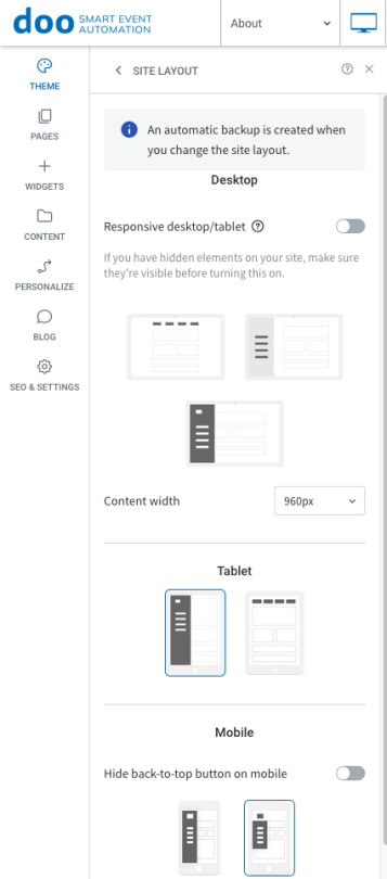
To set a superior design for your website and the end devices, first click on “Design” in the left main menu and then on “Website layout”.
Here you can now select different designs, which each have an effect on the menu and navigation structure. The structure of the PC and tablet is very similar and if the same design is selected here, changes are automatically applied to both views without any problems.
An exception here is the cell phone – here the design must always be considered completely separately.
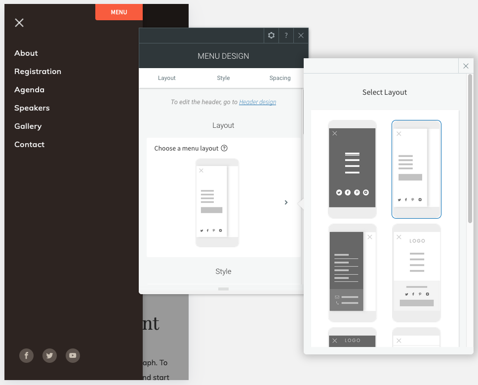
3.2 Menu and navigation structure mobile phone
In the mobile view, you have the most design choices – these primarily affect the placement of the navigation bar.
Changes in the header or footer are not transferred from PC/tablet to mobile, and not the other way around either. This means that for mobile navigation, all changes must be made directly in the mobile view – so select the appropriate device view via your title bar and then select the area you want to edit.
It is recommended to work with different, smaller versions of images or logos than on the other pages when viewing for cell phones.
Also recommended is a side navigation structure that only opens when clicked, as mobile screens are usually far too small for bars in headers or footers, which can lead to confusion.
It should also be noted that a smart menu/navigation structure is only possible via the parent design and not by inserting the Navigation Bar element.
4. How do I optimize my site for mobile devices?
4.1 Hide elements on different end devices
You want to edit an element (text field, image, etc.) because it doesn’t look the way you hoped on one of the devices, but don’t want the changes to affect all devices?
The solution to this is simple, but requires a few steps:
- Copy the element you want.
- Re-insert it above or below the original element.
- Right-click one of the elements, go to “Hide on device” and select the device(s) on which you want to hide the element.
- Now go to the second element and adjust the devices on which it should be visible accordingly.
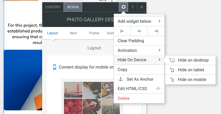
Now you can change the view in the title bar as usual and adapt the respective element perfectly to the end device without the changes affecting the other views.
4.2 Allgemeine Design Tipps & Tricks
Ideally, banners and images of different sizes are used for each view (with the help of the “Hide” function), as only then can an optimal result definitely be guaranteed.
The exact size specifications can be found directly in the doo website editor.
Instead of using large text fields that look good on PC and tablet view, but not in mobile view, you can simply work there with images and a background text, for example.